
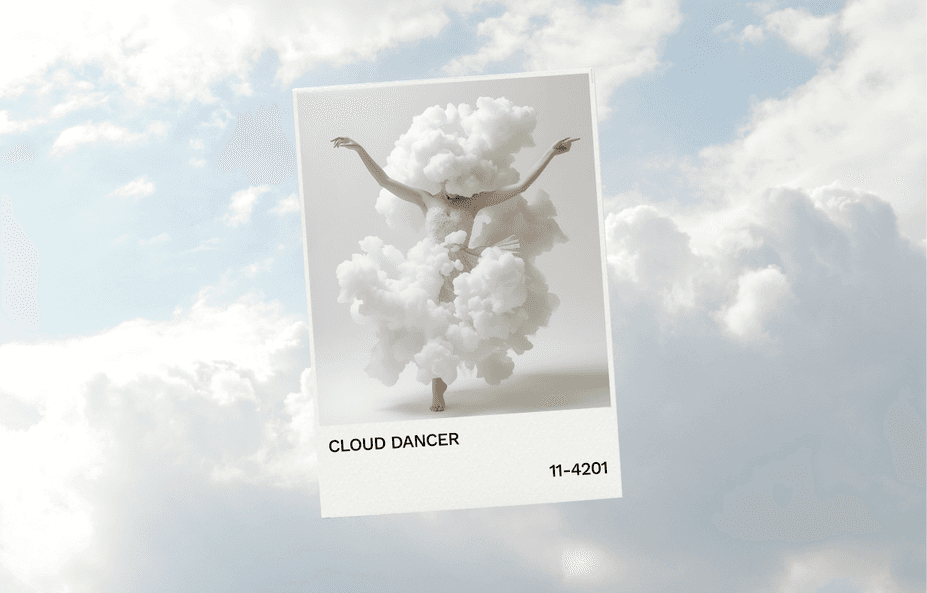
Pantone Color of the Year 2026: Cloud Dancer
Date
Written by
Emily Finke
Reading time
3 min.
News
What Off-White really means for brands, social media, web & learning
Cloud Dancer (Pantone 11-4201) is more than “just another white.” This very light, warm off-white stands for calm, reduction, and deliberate restraint—a counterweight to the sensory overload of digital feeds. At a time when everything is flashing, Cloud Dancer creates space: for content, typography, imagery, and clear messages.
The idea behind Cloud Dancer
Pantone does not set trends by chance: colors reflect the spirit of the times. Cloud Dancer embodies the need for clarity and trust—away from effects, toward essence. Off-whites convey materiality (paper, ceramics, textiles), warmth, and human closeness. They are not sterile, but “grounded”—in the truest sense: a light field that carries content instead of drowning it out.
What this means for brand communication
Off-white is a stage. Headlines, product images, illustrations, and data visualizations stand out more clearly. Brands can appear more editorial, more “magazine-like”: generous areas, clear hierarchies, precise micro-typography. That requires discipline: those who choose reduction must perfect the details—spacing, contrast, reading typefaces, microcopy. The quiet surface hardly forgives mistakes.
Social media: A trend toward calm in the feed
On social, we are seeing an opposite trend: among loud slides, calm, bright visuals are gaining credibility. Cloud Dancer backgrounds bring three effects:
Scannability – Messages are quicker to grasp when whitespace is structured meaningfully.
Perceived quality – Off-white evokes editorial design; content feels curated rather than random.
Series capability – A consistent, bright base layout makes series (how-to, case, commentary) recognizable.
At the same time, using it is no sure-fire success: anyone using off-white needs concrete, focused statements and strong typographic hooks. Otherwise, “calm” tips into “lifeless.”
Web design: Stage instead of wallpaper
On websites, Cloud Dancer contributes to performance and UX. Bright areas reduce visual noise, increase focus on interactions, and improve perceived speed. The key is composition: modular cards, well-placed spacing, clear CTAs. For dark mode, there should be an equivalent, carefully contrasted counterpart—off-white in light mode, deep, warm anthracite in dark mode.
Learning design: Cognitive relief
In learning environments (e.g., e-learning, LMS), Cloud Dancer acts like a concentration buffer. Less visual distraction, more focus on content, questions, and interactions. What matters is didactic guidance: hierarchies, progress indicators, reading width, line height. Buttons, links, focus states, and error messages need clear, high-contrast accents—accessibility is not optional, but part of quality.
Accessibility: the litmus test
Off-white demands responsibility. Text on Cloud Dancer needs sufficient contrast (for body text, usually dark anthracite/black), and interactive elements need unambiguous states. WCAG (AA/AAA) checks, dark-mode equivalents, and proper alt text are mandatory. The elegant look is only professional if everyone can use it.
Critical assessment: Trend or timelessness?
Cloud Dancer is not a radical color stimulus, but a framework—some would say: too cautious. Differentiation does not come from the background, but from content, typography, and photographic style. Brands that merely “brighten up” without working on their narrative appear interchangeable. Used correctly, however, Cloud Dancer is a timeless tool: it puts what matters at the center and makes design decisions visible—for better or worse.
What does this mean for the industry?
Strategy before style: Off-white is worthwhile when messages are clear and content appears regularly.
Sharpen design systems: Tokens for spacing, typography, contrast, and states are more important than new decorative colors.
Increase content quality: Less decoration, more substance: image concept, storytelling, precise claims.
Improve measurability: Calmer visuals perform when hook, structure, and CTA are on point—otherwise not.
And for us?
The same applies to teams like ours: Cloud Dancer is a useful means, not an end. It fits ways of working in which content, readability, and user guidance set the tone. Added value emerges when off-white works together with clear wording, solid typography, consistent accent colors, and accessible implementation.
Conclusion: Cloud Dancer sets a quiet but strong signal. Those who understand the trend use it not as decoration, but as a deliberate stance: focus before effect. This turns off-white into a reliable stage—for brands that truly have something to say.


